Iker Ochotorena
Talks
OOAA ARQUITECTURA
Iker Ochotorena
OOAA Arquitectura
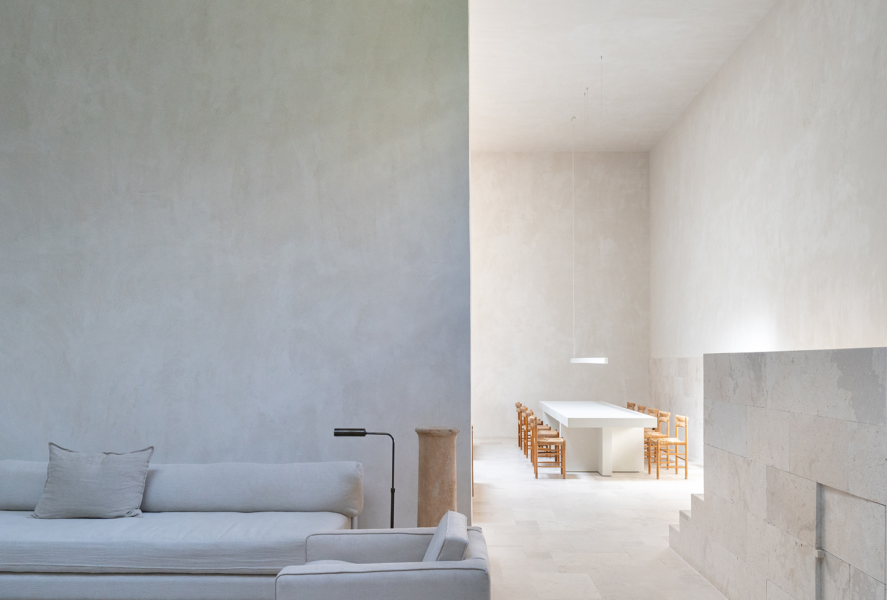
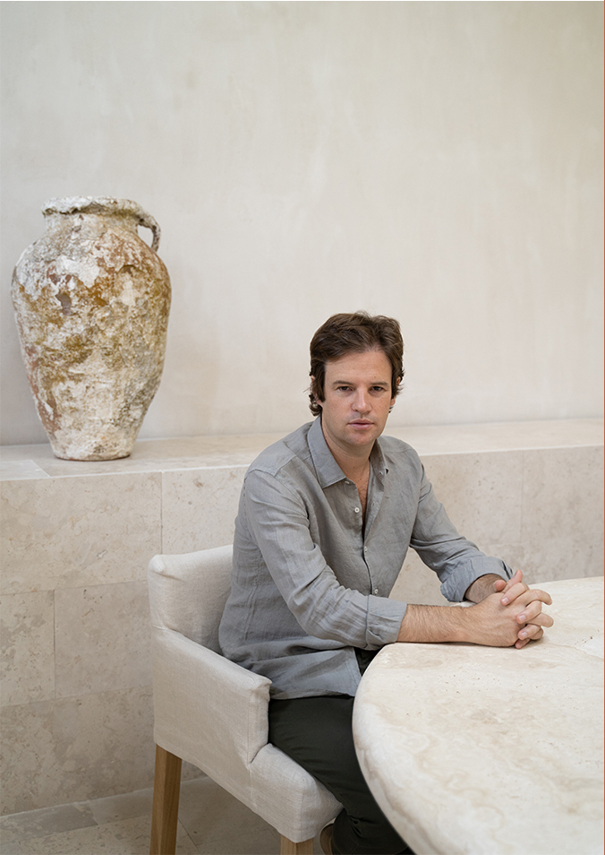
Iker Ochotorena leads the architectural studio OOAA, from which he cultivates restraint and simplicity through the use of natural materials and neutral tones (preferably white). His collaboration with AD magazine and Massimo Dutti has resulted in staging window displays that show the aesthetic twist with which the brand surprises once again.
“the aesthetic being is in the experience of life, in which the senses reach the sublime frequency of beauty”
_MD_
We would like to talk about architecture and fashion, and how we share the goal of turning a need into art. In your projects, we find it highly interesting to talk about simplicity and purism. Is it an aesthetic or pragmatic choice? Just like our collections, which are also characterised by neutral colour palettes and quality, simplicity and a natural feel. We share that vision, which has made us feel so close to your creative point of view.
_IO_
In my opinion, the aesthetic being is in the experience of life, in which the senses reach the sublime frequency of beauty. It is a whole, inseparable. Perfectly visible in fashion and architecture.
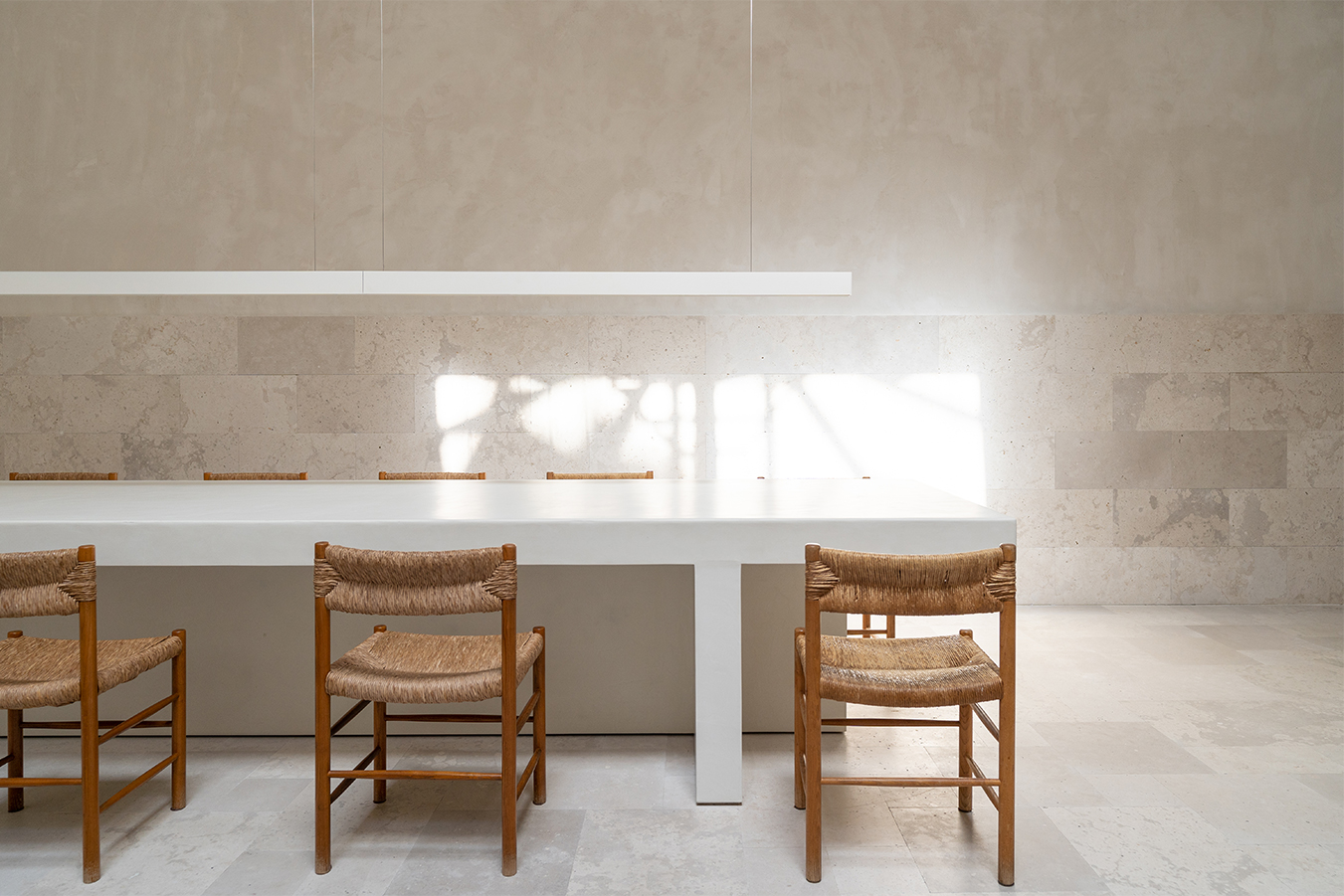
Simplicity in my architecture does not come about as an exercise in containment, where elements appear as an addition where there was nothing.
The process is the opposite, in which the emptiness is valued and the subjects create and enhance it. In this way, I could say that emptiness emerges when we relate two elements and see what happens in between. Do not confuse emptiness with nothingness.
_MD_
What inspires you?
_IO_
Authenticity inspires me. The deep substance of things, the essential, the being of things.
_MD_
Who are the architects and other professionals or artists who have most influenced your career?
_IO_
The architects I have studied most are Luis Barragán, Louis Kahn, and Peter Zumthor; also the artist Jorge Oteiza and the decorator Jean Michel Frank.
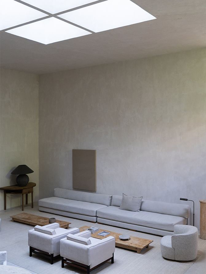
“Technology certainly makes life easier, but I don’t think it is necessary to dress it up more futuristically than it is”
_MD_
In an AD interview, you spoke of the House of the future, saying that it will be ‘very advanced and digitised in its installations, but
imperfect and primitive in its spaces’. This point seems very interesting to us in terms of our physical stores. We don’t aim to have as many screens as possible, nor the most futuristic robot… We are committed to personalised attention and an organic space working with quality and sustainable materials. A space where projects are omnichannel and therefore has very strong support from technological tools (RFID, iPod shopping, in-store reservations through the App).
_IO_
Technology certainly makes life easier, but I don’t think it is necessary to dress it up more futuristically than it is. We are past and future and, in this sense, we also require the primitive, where imperfection calms the eye and another necessary comfort emerges, where we find warmth.
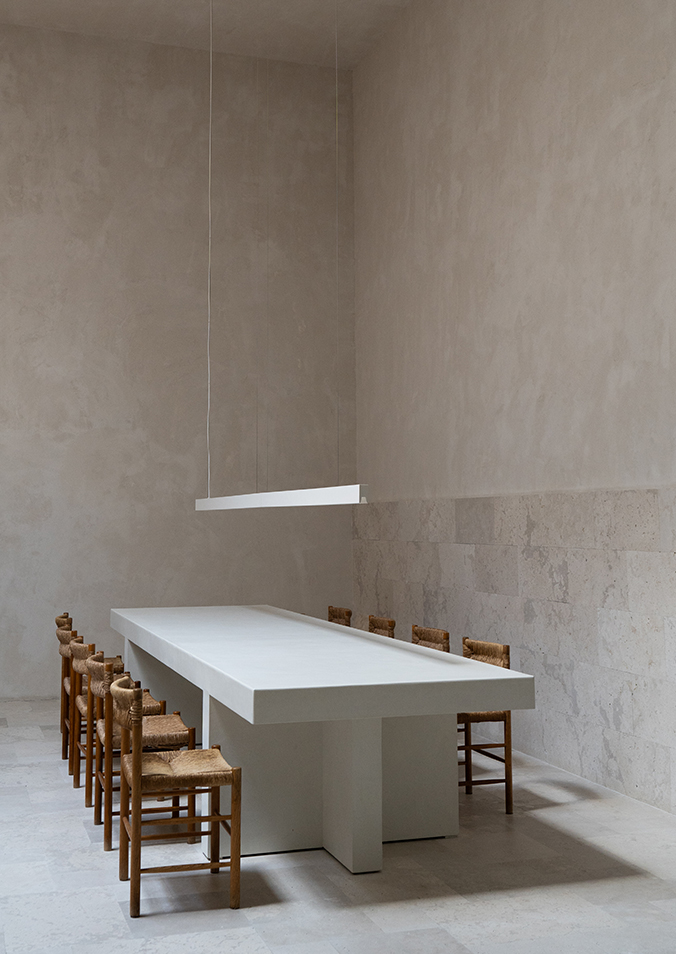
“Simplicity, warmth and quality are perceived in Massimo Dutti’s fashion as well as in the interiors of the stores”
_MD_
What impact has your perception of environmental sustainability had (and still have) on your projects?
_IO_
It is essential, in any good architectural project, to use natural resources, such as materials from the environment, to create shadows in large windows or to help with ventilation. For me, these aspects are fundamental, and interiors from a sustainability standpoint with the possibility of equipping the house with active air conditioning systems and installations. It may be difficult not to fall into contradictions, but it is necessary to listen to reason in this matter.
_MD_
What was your inspiration for our window display installation for the ARCO Madrid fair? How would you defend the project?
_IO_
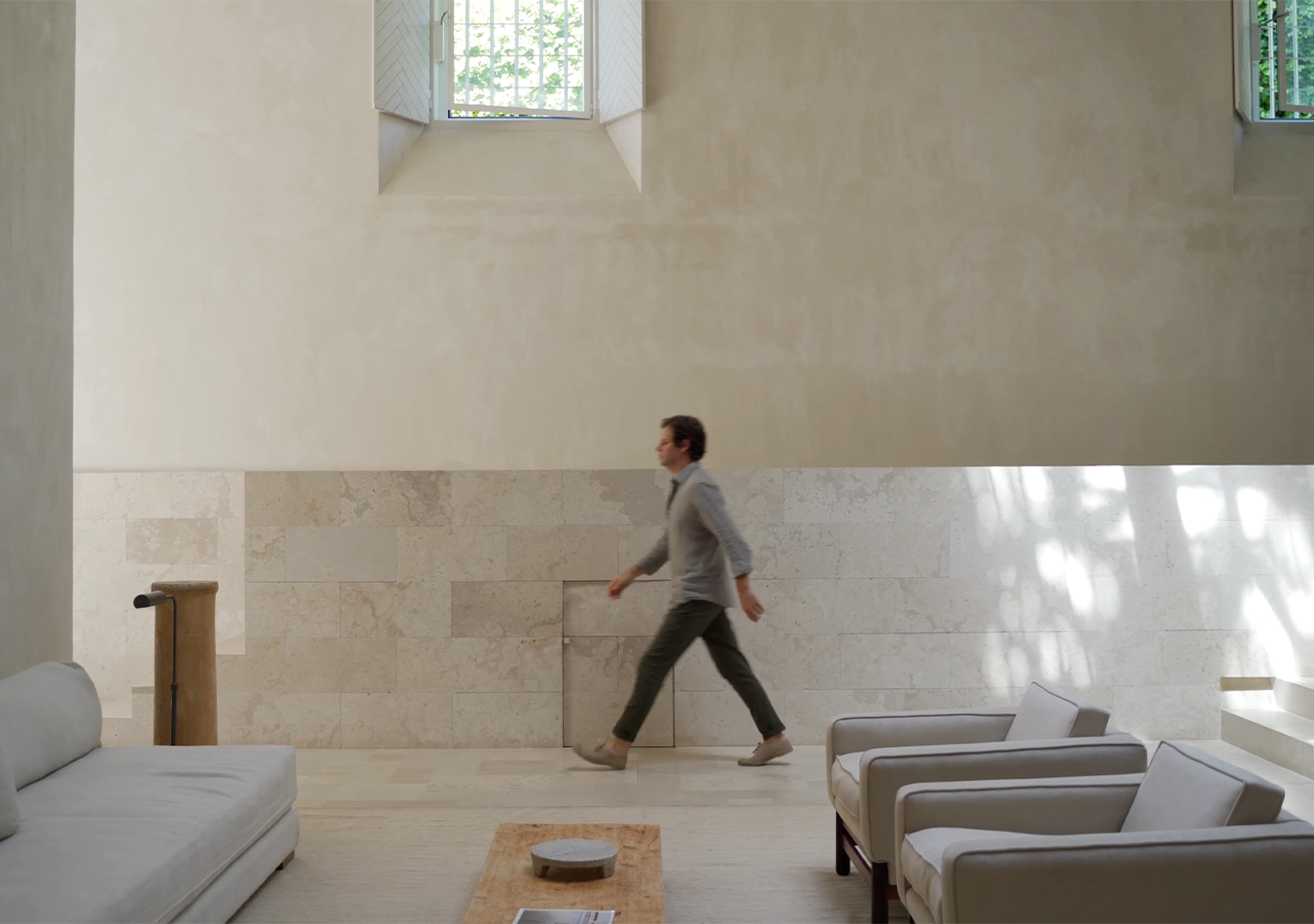
Simplicity, warmth and quality are perceived in Massimo Dutti’s fashion as well as in the interiors of the stores, and these are aspects we feel identified with and that are in our architectural discourse. So it was a continuity of what we usually work with.
At first we studied the building’s façade. And the bone colour on both sides could be brought into the interior of the window display, framed in black, and the classic vertical window rhythm of the upper floors of the building connected us. We reinterpreted it with three panels per window, with a similar rhythm that gave them an almost architectural depth.
These panels, blending in with the background of the same design, provided us with simplicity, where only the art pieces and mannequins were to be bathed in light and in a freer arrangement, like elements dotted in a composition of balance.
All this, with almost no concessions to colour, helps convey a weightless, veiled clarity.
Linen on linen brings warmth without resorting to ochre colours.
And lastly, careful attention to textures such as the floor, the joints between panels and the generous proportions helped us to create a high-quality scene.
_MD_
¿Will architecture undergo a radical change??
_IO_
Not the essence of architecture. Light, emptiness and mass are elements that have not changed since ancient times, but prefabricated building systems will reduce time and cost, and improve the quality of execution.
Although I believe that luxury will be close by, in its expression of authenticity, where the cracks are worked imperfectly, the tactile is cared for to unimaginable levels and the senses are heightened.
_MD_
Define yourself in a few words
_IO_
Tenacious, passionate about architecture and family-oriented.
